Masterful Seaming

Monday, January 30, 2006 0 comments

Here is a deceptively simple 1940's playsuit by well known sportswear designer Carolyn Schnurer. This suit appears to be a straight cut bodice with a flared skirt. But take a closer look at how the designer has attached that skirt.


See those intricate zig-zag seams at the waist? If you've ever tried to sew a V neckline, you know how difficult it is to get these V pointed seams to lie perfectly flat. And yet, here are several of them all the way around the waistline! And there's more...

Additional seams extend diagonally up from the center front seam to the bustline. These seams draw the eye in to the center waist and help give the illusion of a slender middle.

None of these decorative seams is necessary to the finished garment, and they certainly added to the difficulty of manufacture and cost, but I think this playsuit is much more interesting and effective with them. Don't you?

See this playsuit and more at Couture Allure Vintage Fashion .

How Clever!

Wednesday, January 25, 2006 0 comments

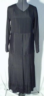
This is a simple little black dress dating to the late 1920's. The straight silhouette is a trademark of the 20's, but the longer length is a hint of things to come in the 1930's. Everything about this dress is straightforward and unadorned, save for the few pleats at the sides of the skirt. However, the seamstress has relieved the severity of the design with a clever trick. The center panel that encircles the waist reflects light differently than the upper bodice and skirt. This is because that piece of the dress was cut on the crosswise grain of the fabric rather than the lengthwise grain, as the rest of the pieces were. Such a simple idea, but it really works to give the dress some much needed visual interest!

See this dress and more at Couture Allure Vintage Fashion .

Balanced Asymmetry

Wednesday, January 18, 2006 0 comments


Designers always try to "balance" a design to make it pleasing to the eye. A large pocket at the hip will be balanced with a smaller one at the bust. Trim that accents a neckline is repeated at the waist, hips, or hem. A large busy print is balanced by using simple design lines and seams.

Other times, designers will use asymmetry to make a design look balanced, when its really not. Such is the case with the vintage 1940's dress shown above. Take a closer look at that neckline. The V shaped neck opening is slanted off to the right, but the two curving pieces of fabric on top swirl to the left and make the design pleasing to the eye. Balanced asymmetry.

But wait! This design is also balanced in another way! The soutache and rhinestone trim at the neckline is balanced by also adding it to the pocket flaps at the hips. Genius. Another reason to love vintage clothing!

See this dress and more at Couture Allure Vintage Fashion .
It's All in the Details

Tuesday, January 17, 2006 0 comments


This past Sunday's Boston Globe Magazine featured a small article called "Seams Just Right". The writer pointed out that modern designers are using interesting seaming techniques this season to emphasize a garment's construction rather than hiding it.

Those of us who love vintage fashion, have known about this designer secret for years. It's one of the reasons I find vintage fashion so fascinating.

Take this deceptively simple 1950's dress as an example. The designer has given us a basic navy crepe sheath and made it special by adding a series of angled darts that radiate up into the bodice and down into the skirt from the center front waistline. Not only does this add visual interest to a simple design, it cleverly draws the eye in to the center waist, giving the illusion of a tiny waistline.

Also notice the quality of the workmanship here. Each of those darts is perfectly matched along the waist seam. Even the center front seam is exactly aligned with not a stitch out of place. We just don't see such attention to detail in today's garments.

If you like this dress, you'll find it and many others in our online store at Couture Allure Vintage Fashion.